By: Ellen C. Caldwell
for JSTOR Daily
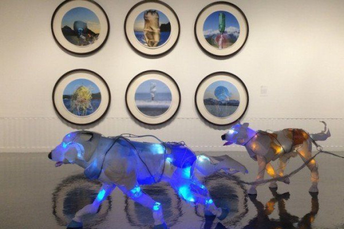
Earlier this month, Google Maps added a special feature for coastal Los Angeles: predictive maps illustrating the effects of global warming on different neighborhoods throughout the city. This same month, USC’s Fisher Museum opened two simultaneous exhibits (GYRE: The Plastic Ocean and Cynthia Minet’s Beast of Burden) showcasing environmentally-themed art focusing specifically on the dangers of plastic on the environment.
These exhibits offer a range of events for visitors, students, and families, enabling them to interact with the art while learning about the environment. Eco-visualizations, such as Google’s effort, Eco-art, and environmental museum exhibitions, have made environmental data and science more accessible through visual illustrations. In other words, we might learn about the data, but it becomes much easier to process once it has been translated visually.
Artist Tiffany Holmes explores how such visualizations help make the data more meaningful. “Eco-visualization technology offers a new way to dynamically picture environmental data and makes it meaningful to a museum population.” In this sense, she argues, artists become translators…
